Overview
This case study details my experience designing Focus Cafe, a mobile app that connects students worldwide for live, collaborative online studying. The app aims to provide motivation and focus, ensuring students can stay productive and engaged even when studying alone. By fostering a virtual community, Focus Cafe helps students overcome the challenges of solitary studying.
My contribution
User research
UX Design
UI Design
User Testing
Tools
Figma
Procreate
Google Form
Duration
12 weeks
Design Process
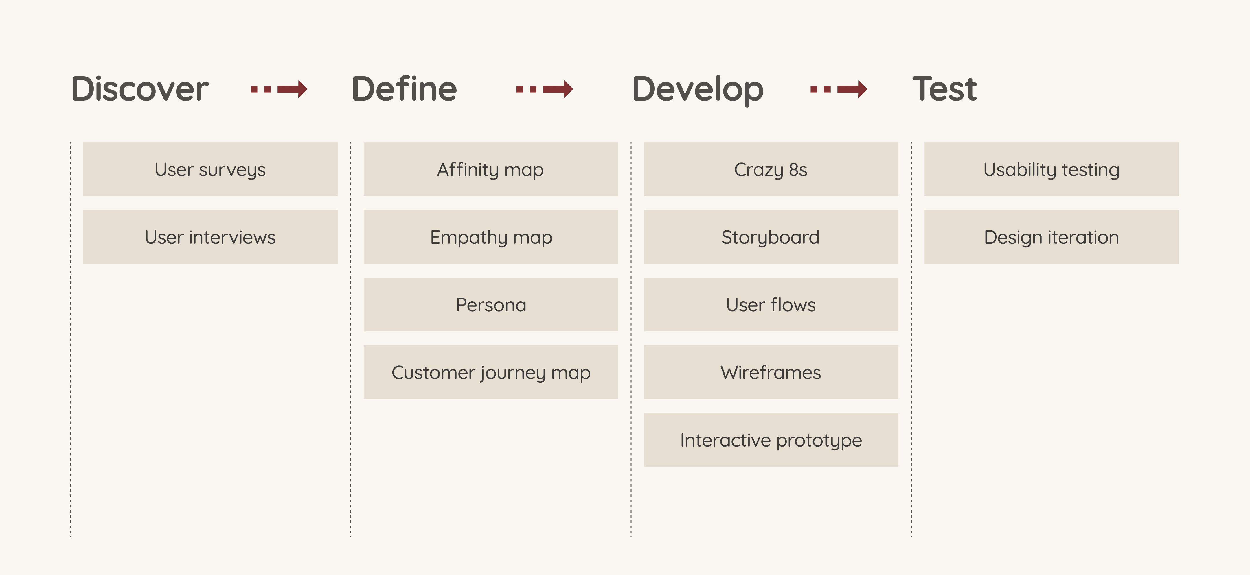
Discover: Conducted user research to understand students' needs and issues with existing study apps.
Define: Created affinity maps, empathy maps, personas, and customer journey maps to synthesise user information and identify key insights.
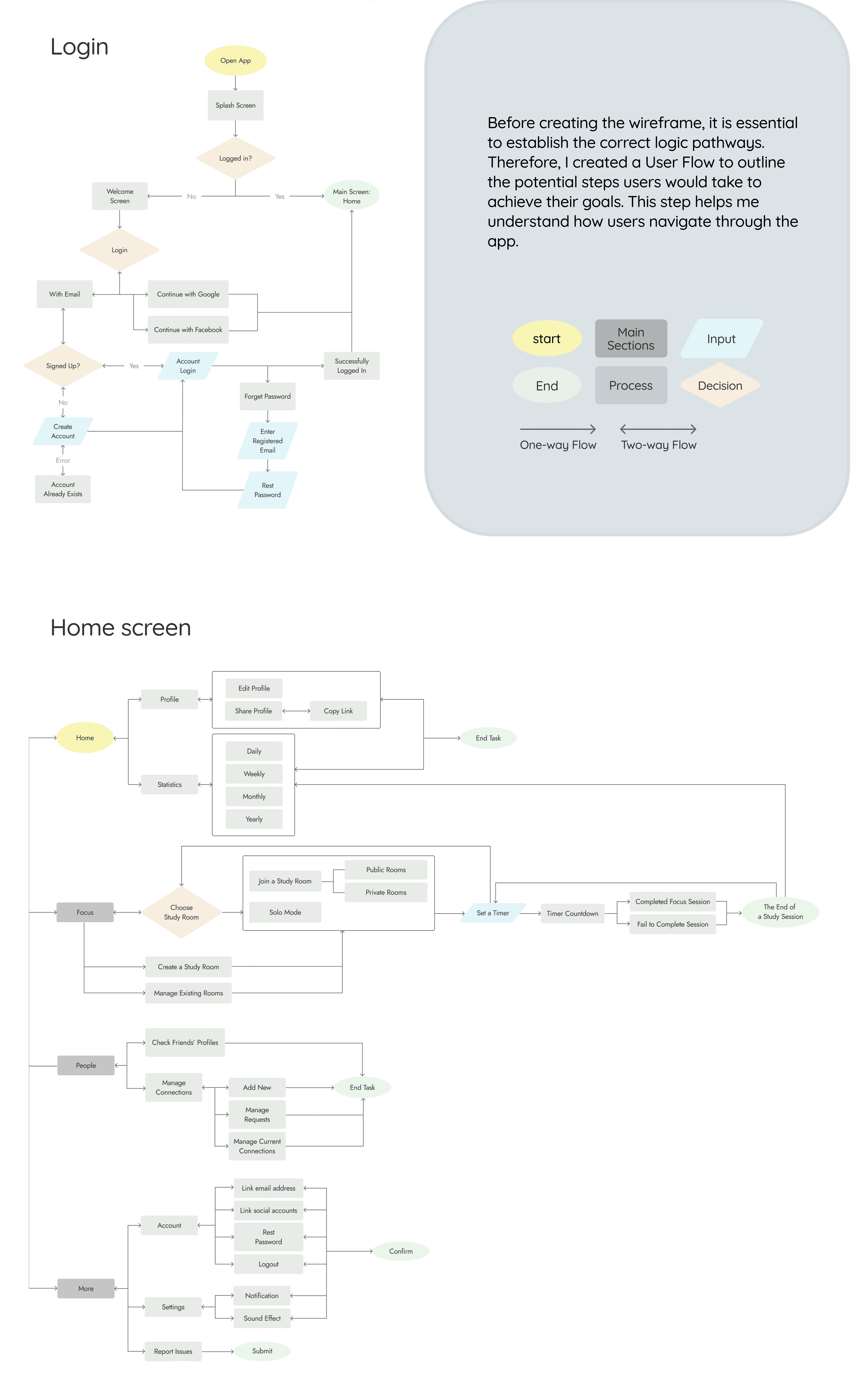
Develop: Used Crazy 8s, storyboards, user flows, and wireframes to design an interactive prototype with features such as study rooms, a Pomodoro timer, and study time statistics.
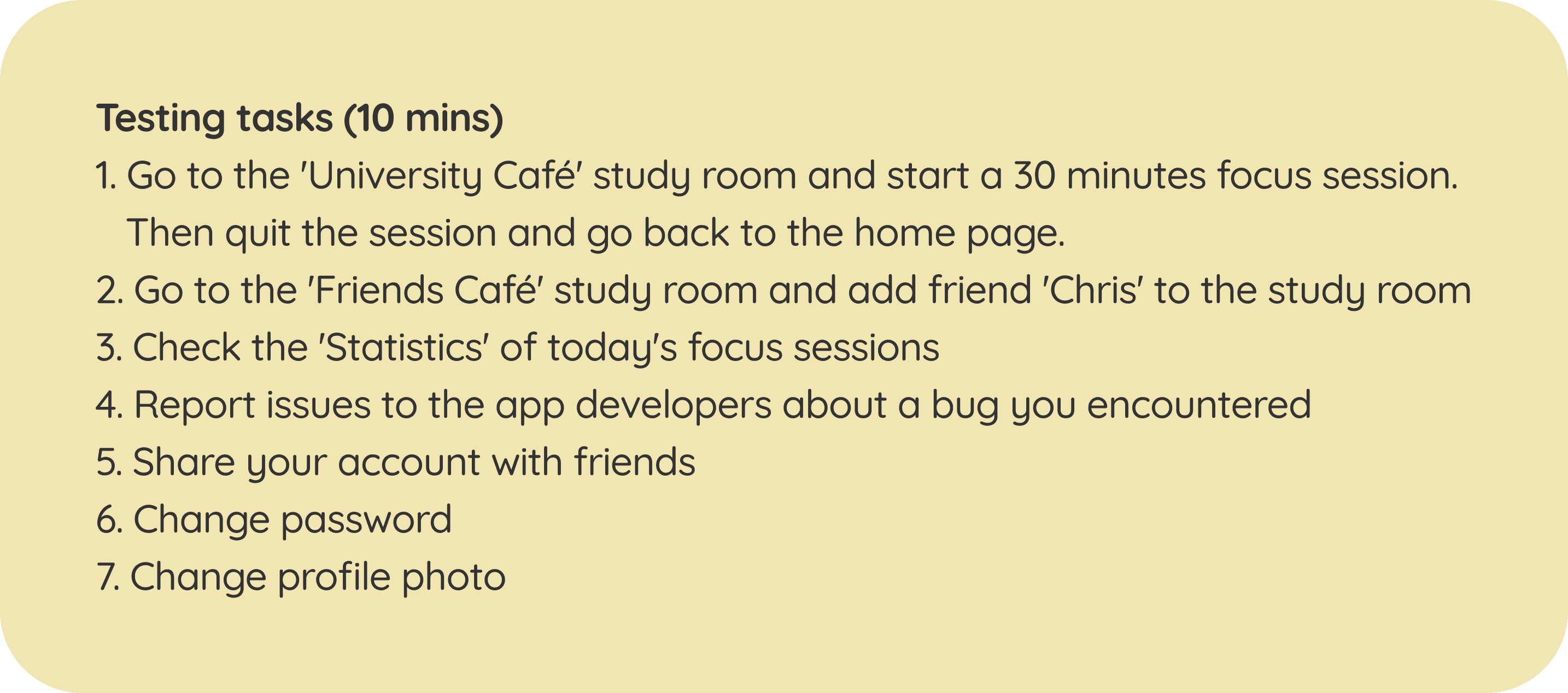
Test: Conducted user testing to validate design decisions, identify usability issues, and improve the app through iterations.
Defining the Problem
During the COVID-19 pandemic, many students, including myself, have had to adapt to remote learning on platforms like Zoom. Studying at home alone is more challenging than in the collaborative campus environment. Many have reported decreased motivation. From this, I've identified the problem:
Students who want to study with peers often struggle to coordinate video calls or arrange in-person meetings. They seek a seamless group study experience, but current online tools do not meet their needs adequately.
Research 1 / User Survey
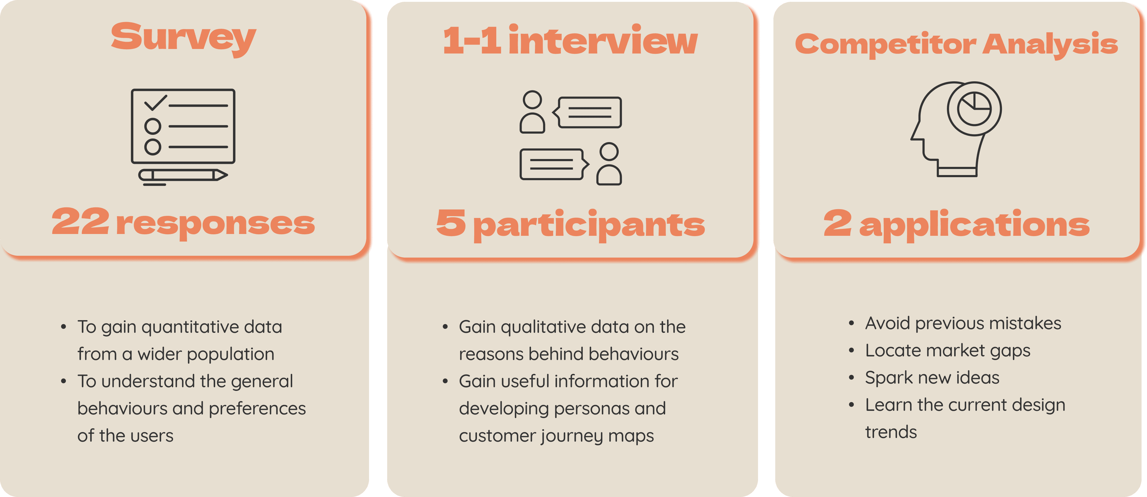
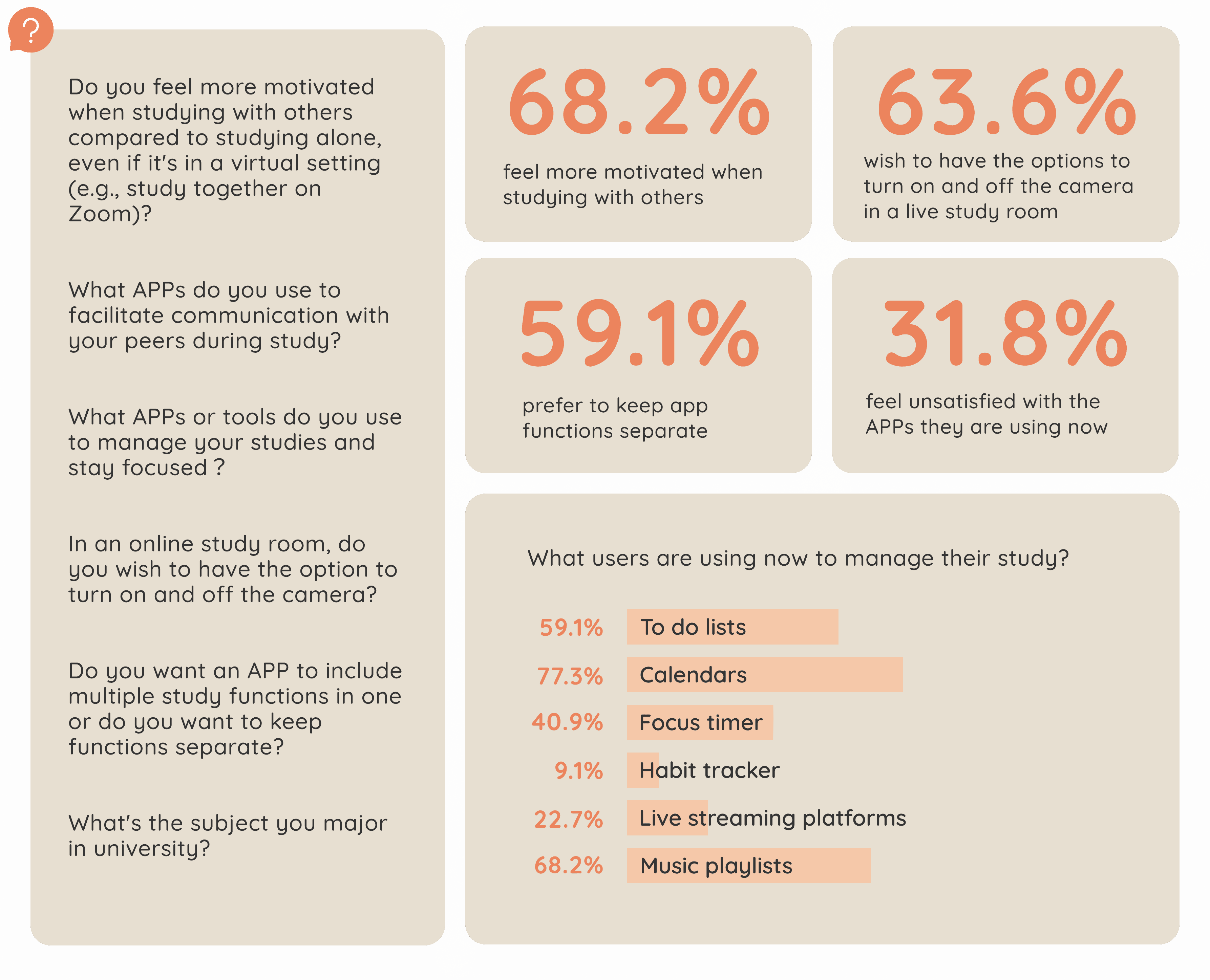
The survey, administered via Google Forms, comprised 12 questions and received 22 responses. Below are some sample questions and key insights from the results:
Research 2 / User Interview
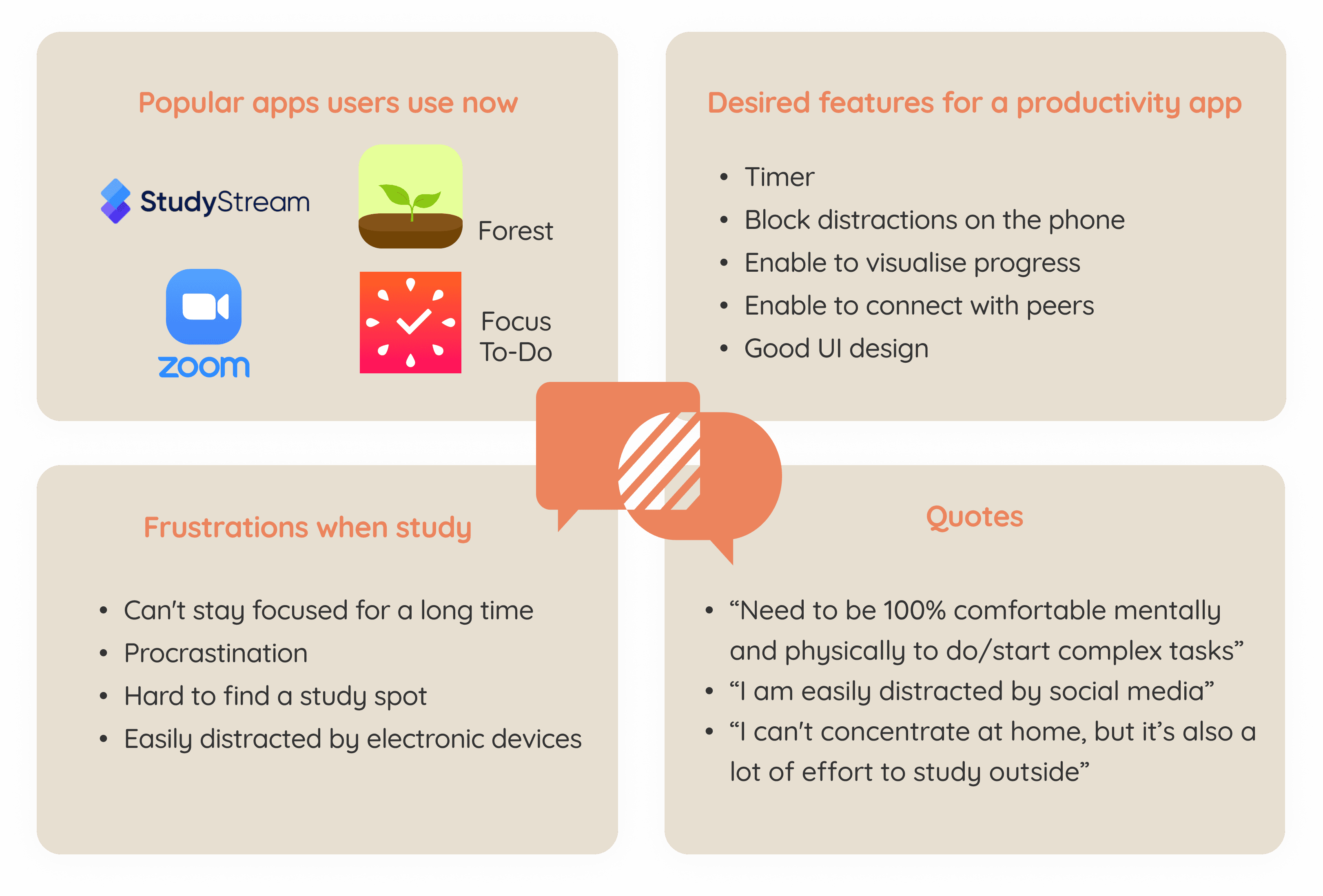
The interviews were conducted through audio calls and recorded for analysis. Five students participated in one-on-one sessions, answering a variety of questions. Here are some examples of those questions and the insights I gathered.

02 Define
Establishing the User's Needs and Problems
Affinity Map
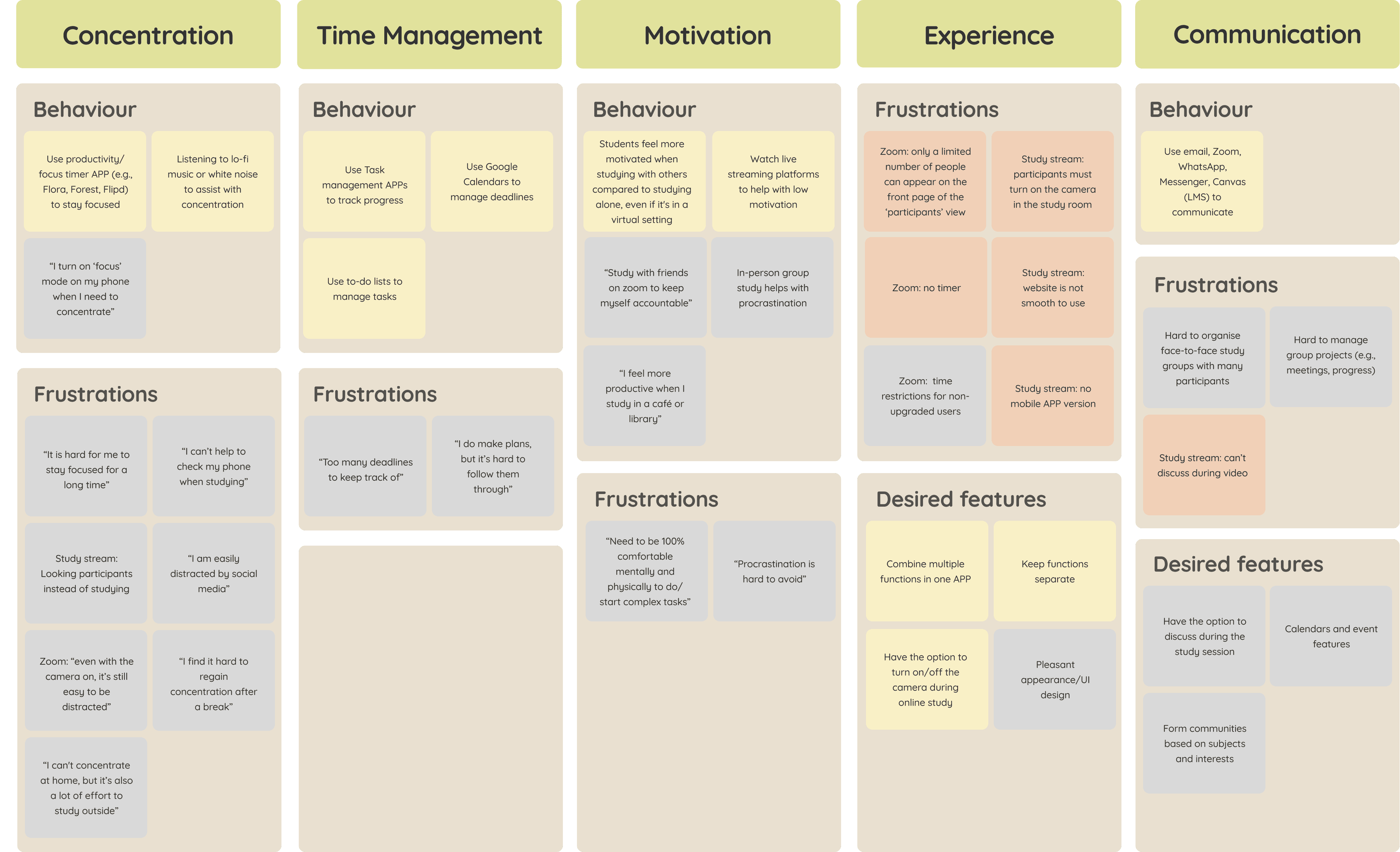
After conducting research, I synthesised the information into an affinity map. This provided a detailed look at user behaviours, frustrations, and needs. By identifying recurring patterns, I gained important insights into the users' identities and genuine needs.

Empathy Map
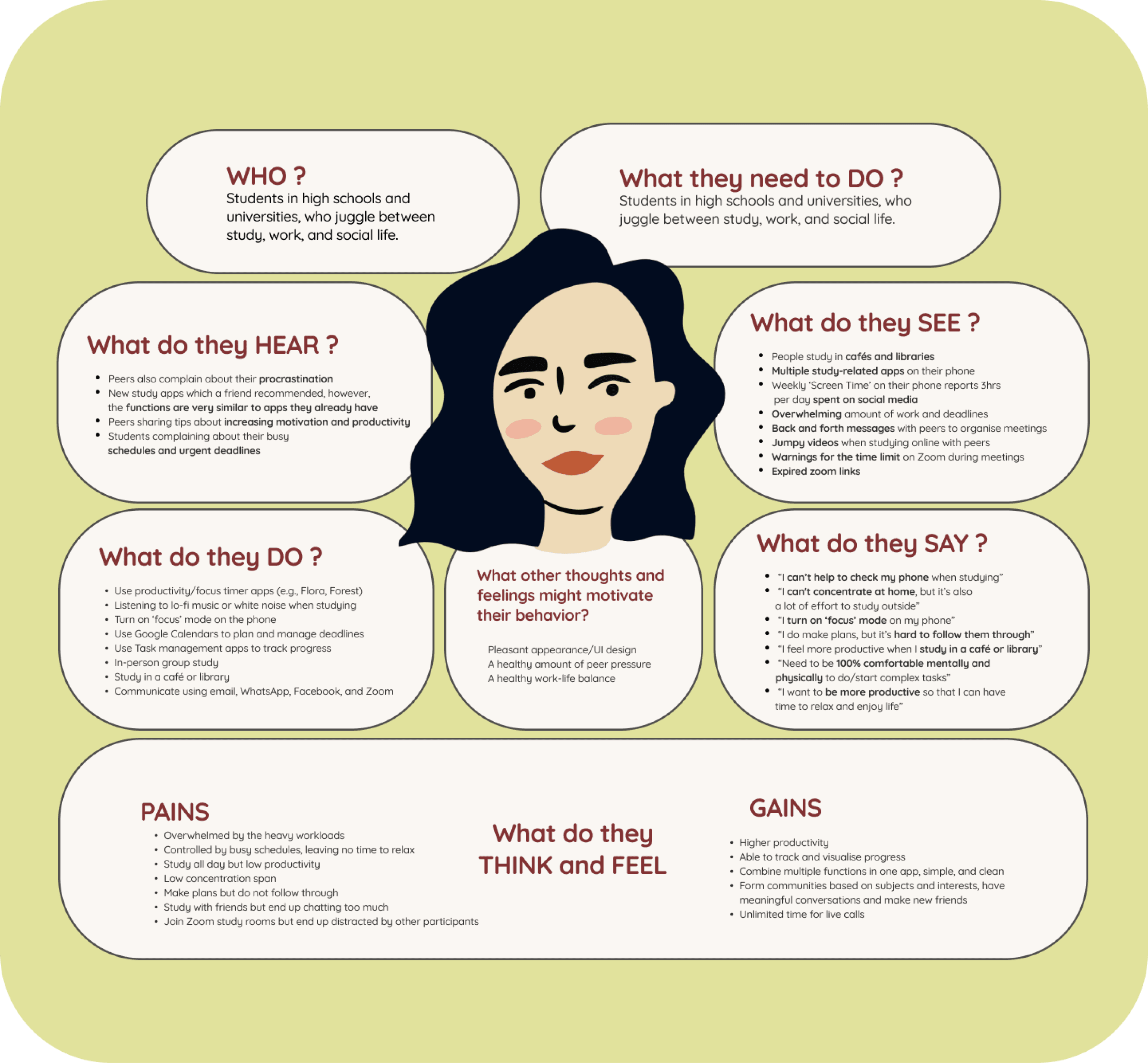
The empathy map visualises my understanding of users and helps me empathise by capturing their actions, perceptions, and emotions, deepening my understanding of their behaviour and feelings.
Persona
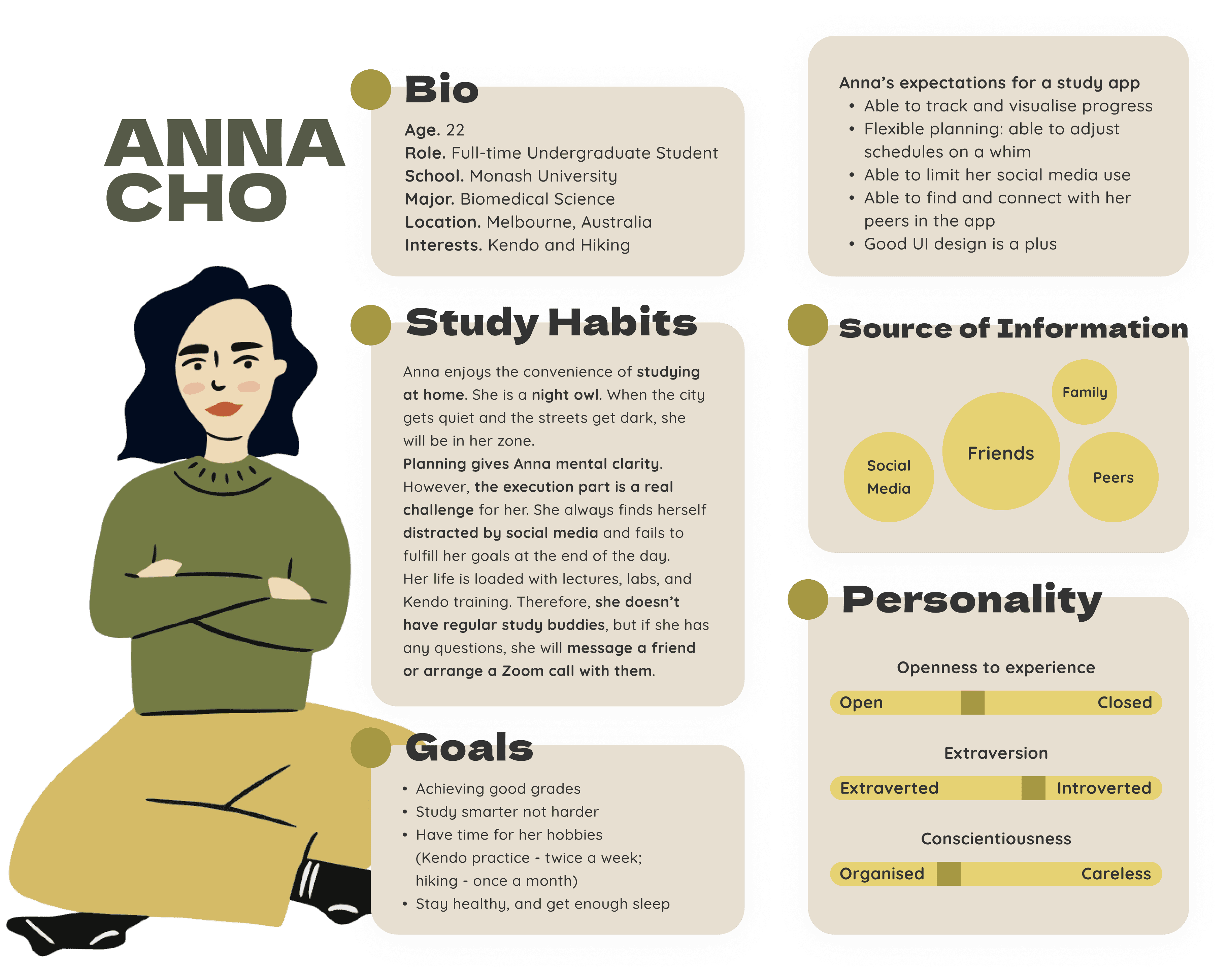
Drawing from the research findings, I developed a persona that embodies the study habits, goals, and needs of our main user group. The persona helped me ensure every feature and function I designed was done with the user in mind.
Anna is a busy university student who enjoys spending time with friends but often feels introverted in social situations. Though she loves planning, sticking to her plans proves challenging due to constant distractions. Her hectic schedule makes in-person study sessions difficult, so she has started using Zoom to study with friends online.
Customer Journey Map (CJM)
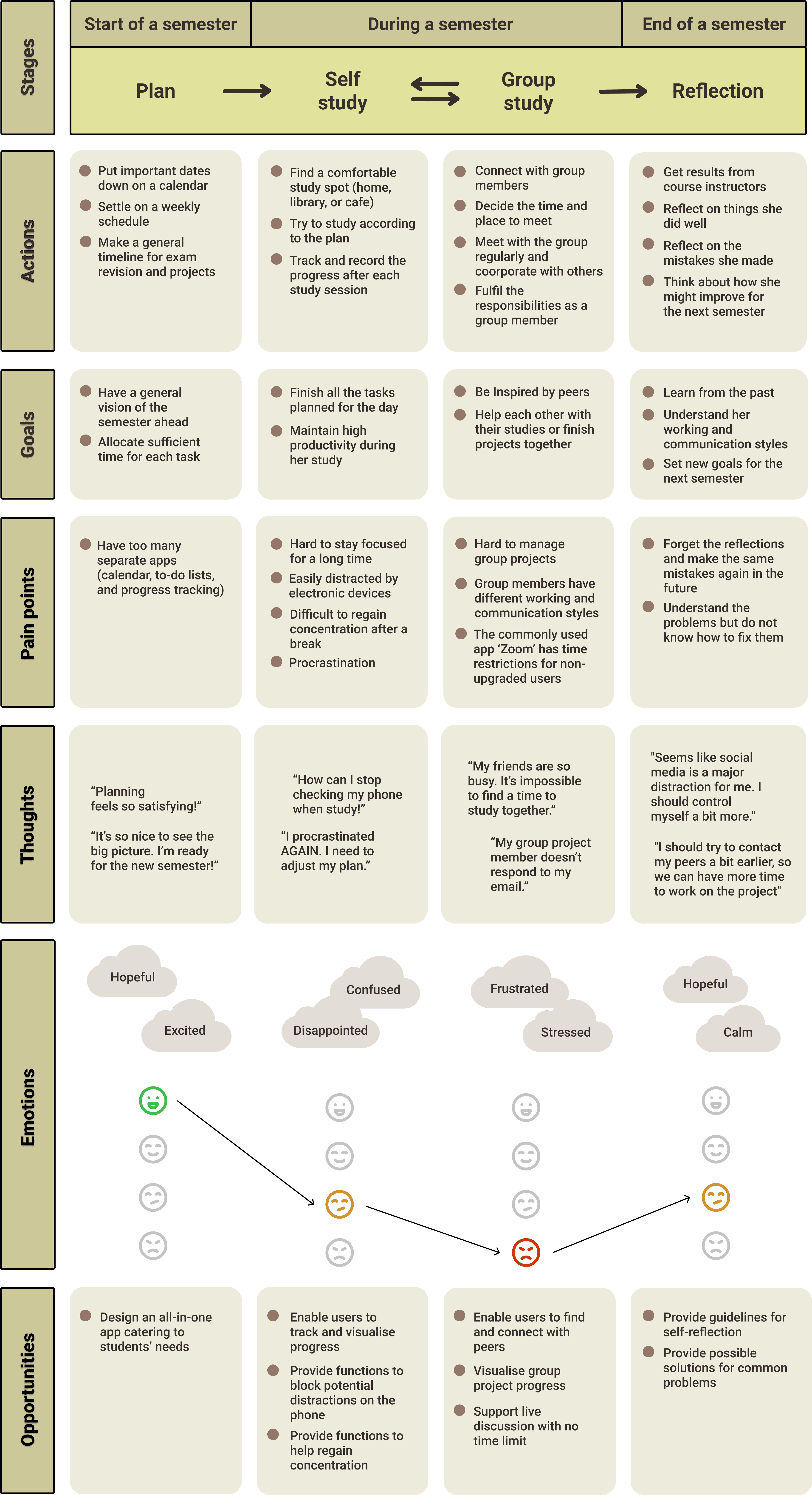
To get a better understanding of the students' experiences throughout the semester, I created a customer journey map (CJM). This map captures the detailed actions and thoughts of the students at various stages of their studies. By highlighting these insights, the CJM reveals opportunities for me to develop an app that truly meets their needs and makes their academic journey smoother.
03 Develop
Designing Experiences and Frameworks
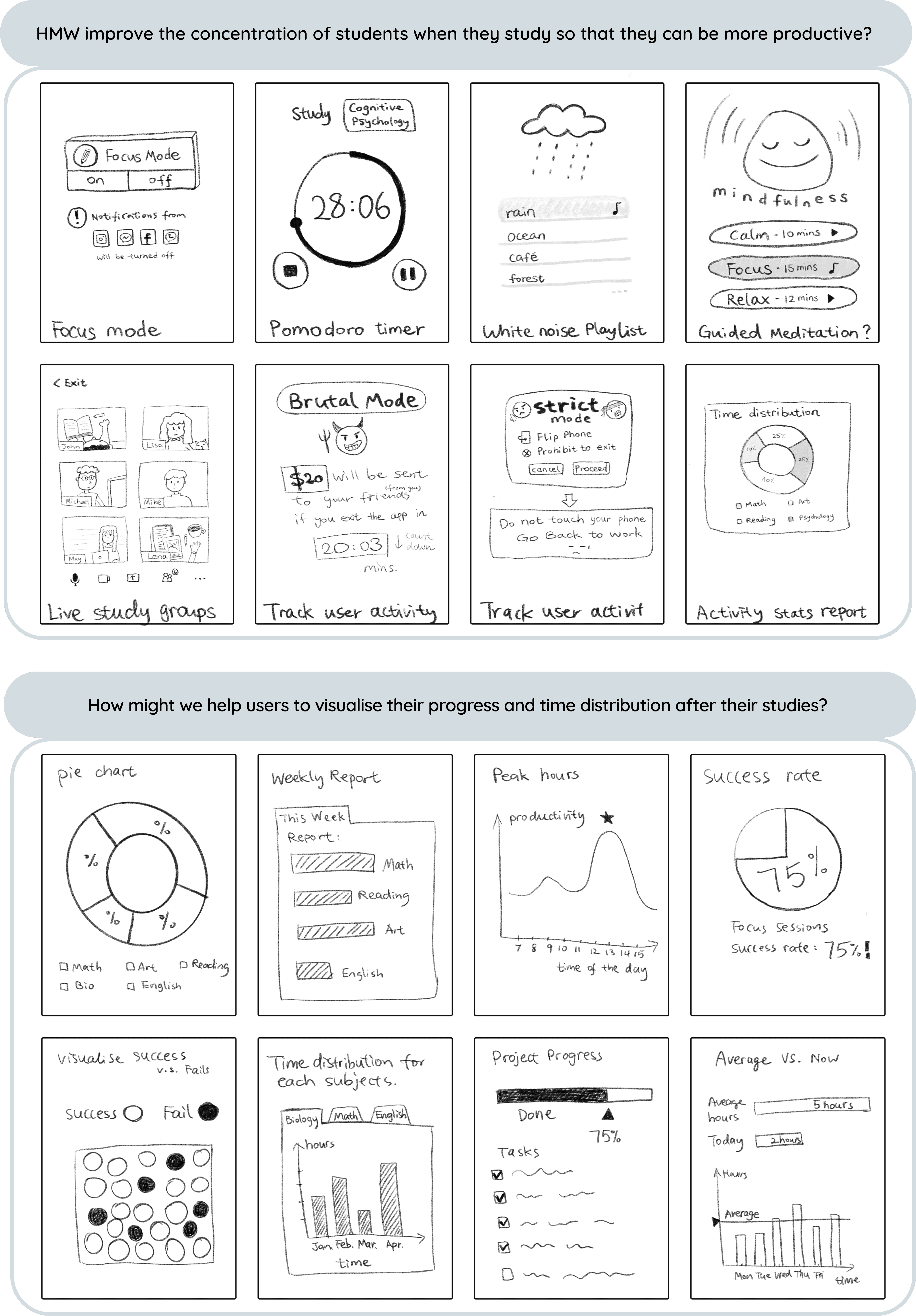
How Might We Statements
"How might we improve the productivity of students so that they can finish their work as planned?"
"How might we help users visualise their progress and time distribution after their studies?"
"How might we reduce distractions for students when they study so that they can focus on their tasks?"
Crazy 8s
In the brainstorming stage, I conducted three sets of 'Crazy 8s' for two 'How Might We' questions, rapidly generating a variety of solutions. I then refined the sketches to be more informational. This quick sketching process revealed a couple of promising ideas for further refinement and implementation into the app.
Storyboard
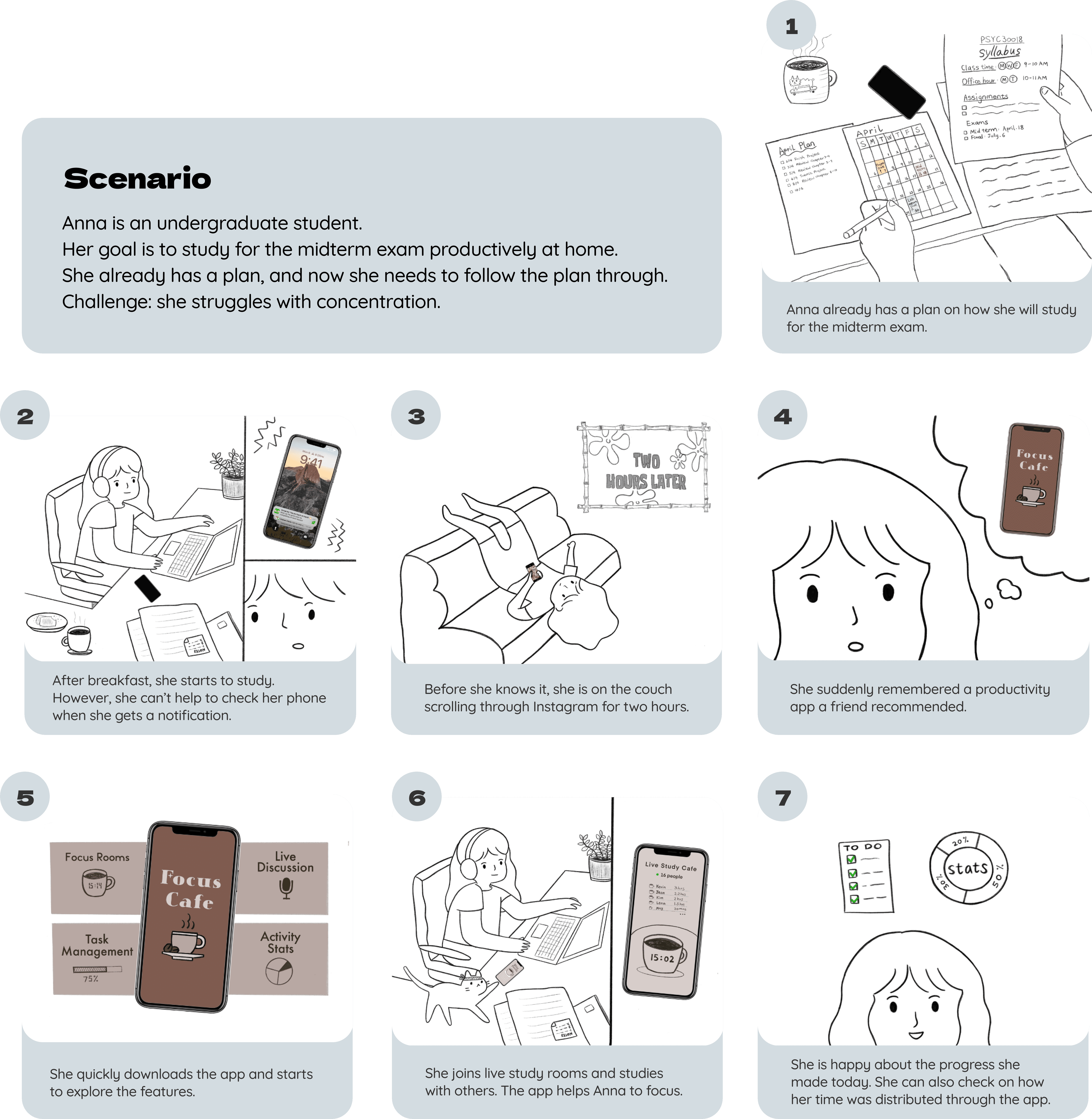
After gaining confidence in understanding the users, I created a storyboard to illustrate their step-by-step experience with the product, highlighting major emotions and interactions during the user's journey. In this storyboard, Anna, an undergraduate student, aims to study productively for her midterm exam at home. She has a plan in place but struggles with concentration.
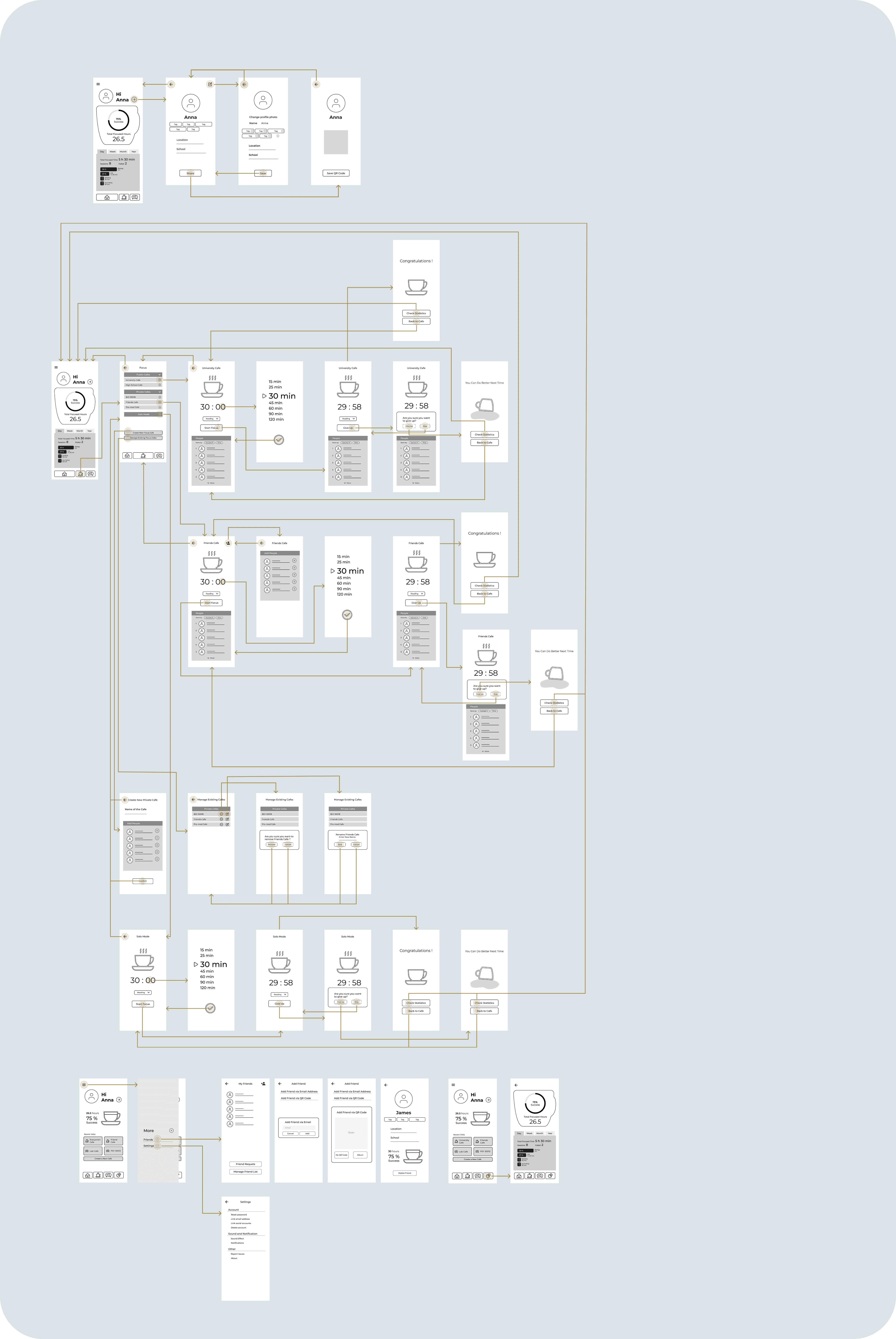
User Flow
Wireframe
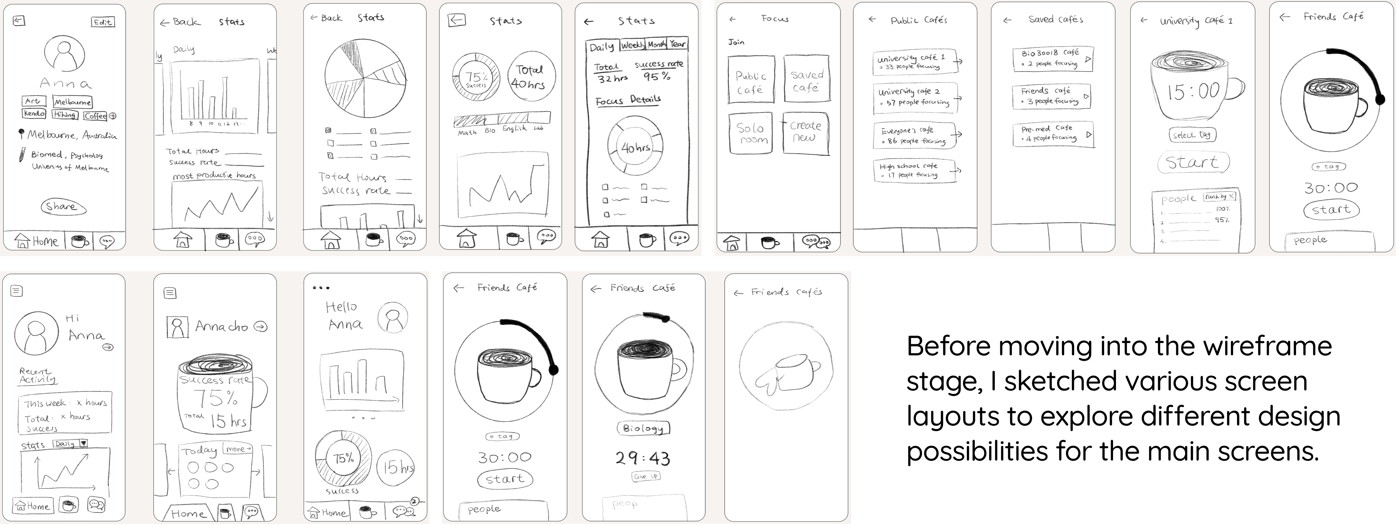
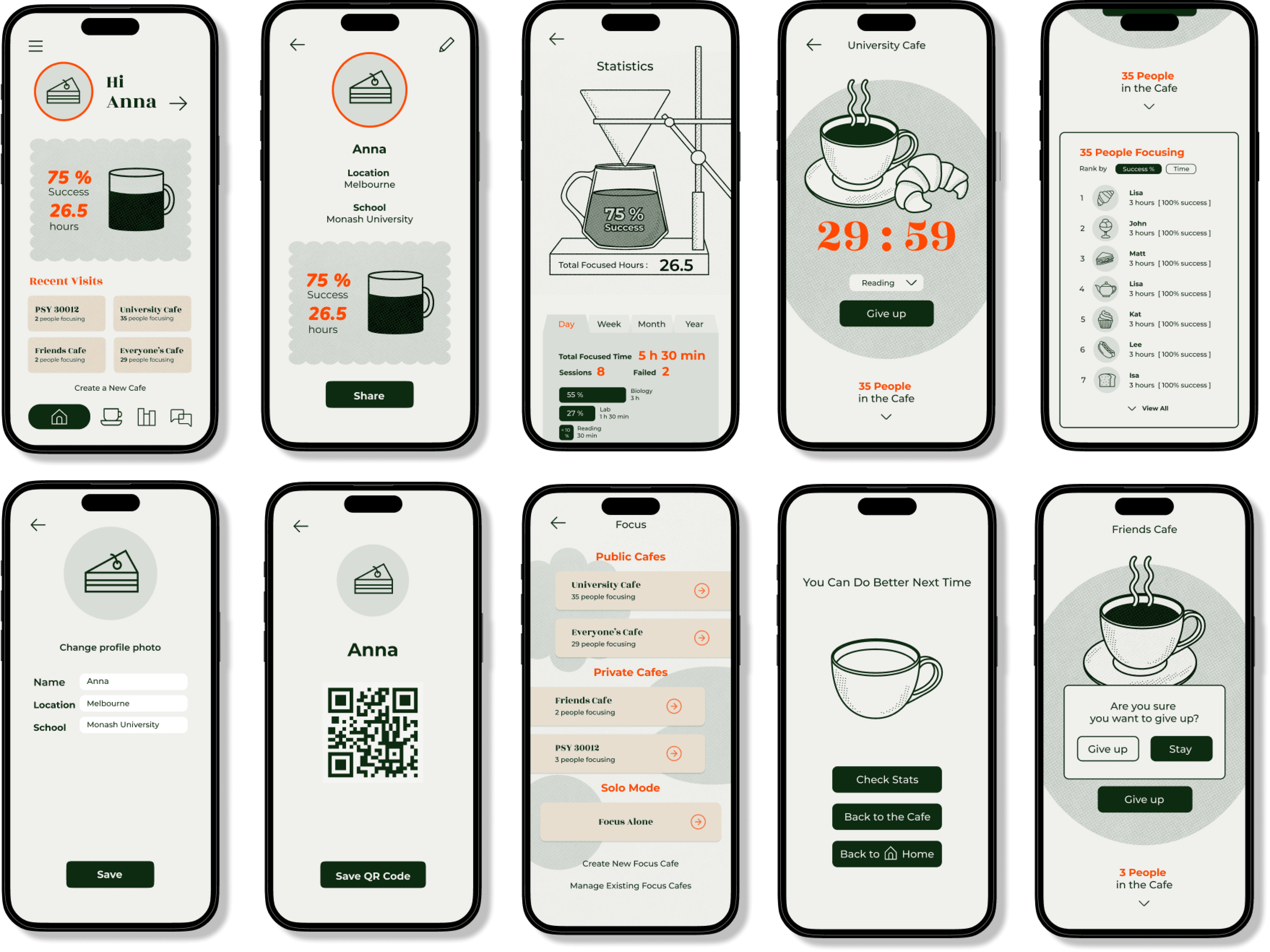
Next, I digitised the paper sketches into wireframes using Figma to refine the design and layout. This process helped me determine the necessary functionality and content, such as the study rooms, profile, and statistics screens.
Visual Identity
High-fidelity Prototype
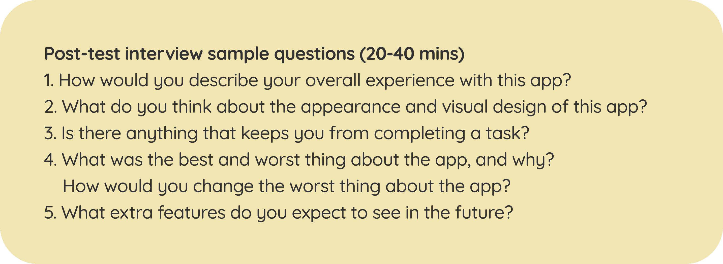
Usability Test Findings
Ease of Navigation
Participants found navigating the app to be straightforward and logical. The design layout was intuitive, and no one experienced confusion when locating features. However, there were some consistent areas where most participants took a bit longer to proceed. These areas were improved during the iteration stage. Overall, all participants agreed that the app was easy to use.
Visual Design and Aesthetics
The visual design received positive feedback. Participants appreciated the aesthetically pleasing illustrations and the minimalistic style of the app.
Favourite Features
The standout feature for participants was the statistics report function, which they found very helpful for their daily studies. One participant particularly appreciated that the app does not overly emphasise ranking between users. She believes that this "recklessness" feature will help promote productivity healthily and sustainably.
Expectations for Future Addition
Participants highlighted the statistics reporting feature as the most valuable aspect of the app. They expressed interest in seeing more types of analyses in this section in the future, such as ranking focus duration by subjects and identifying peak study hours of the day. One participant also suggested adding more illustrations and interactive elements to make the interface more enjoyable to explore.
Design Iterations
After summarising the corrective measures from the usability tests, I revisited the prototype and implemented the necessary changes. I adjusted the areas where participants experienced delays, enhanced the statistics report function, and refined the overall design. These modifications aimed to create a smoother, more intuitive user experience.
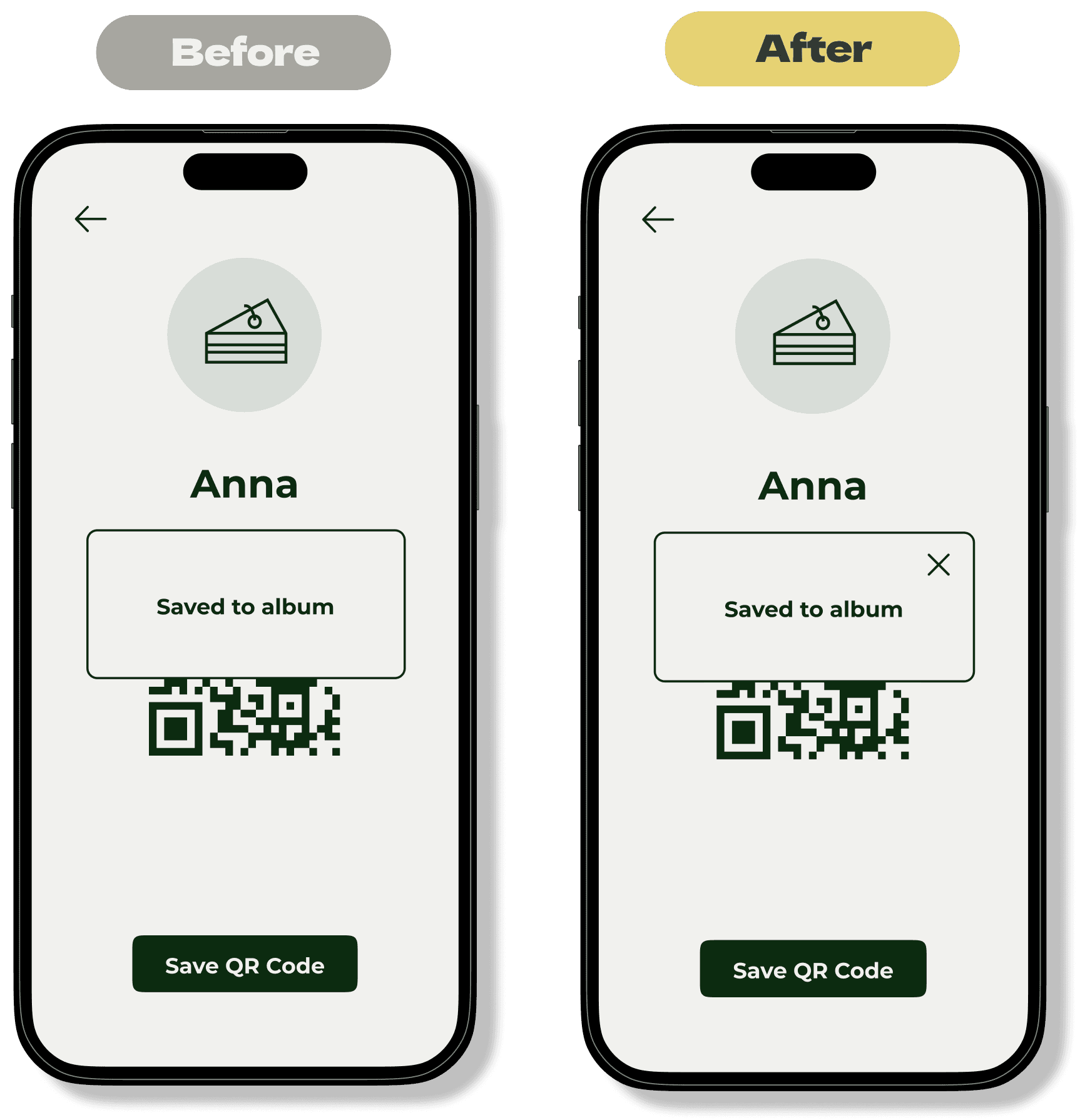
Adding a Button to Close Popup Windows
Observation
Originally, the popup windows could be closed if the user clicked outside the window. However, this feature was not clear or intuitive. Many participants had to click randomly to figure out how to close the window.
Solution
To enhance clarity, I added a close button to the popup windows. This simple addition made it immediately obvious how to dismiss the popups, improving the overall user experience.
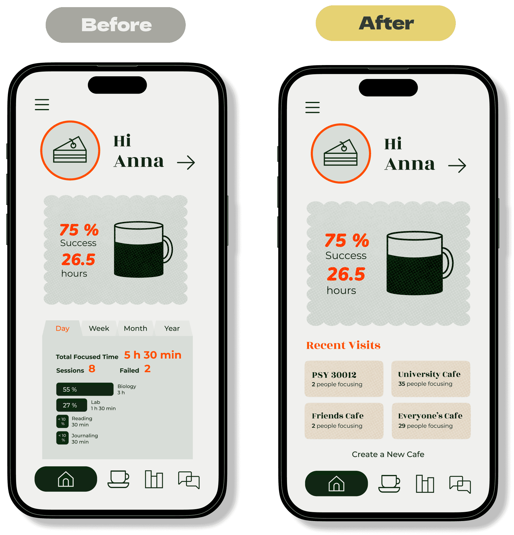
Replacing Detailed Statistics with Focus Room Shortcuts Feedback
Feedback
Participants noted that the statistics report on the home page repeated the same information found on the statistics page. Additionally, they found that there were too many steps required to start a focus session.
Solution
To streamline the process, I replaced the detailed statistics report on the home page with shortcut buttons for recently visited study rooms. This change allows users to quickly join a study room directly from the home page, reducing the number of steps needed to start a focus session.
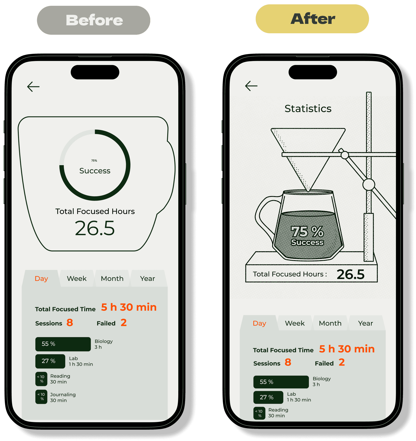
Redesigning the Statistics Page
Feedback
One participant found the design of the statistics page to be a bit flat and boring.
Solution
To enhance visual appeal, I redesigned the statistics page and incorporated illustrations to make it more engaging and interesting. This change not only addresses the participant's feedback but also adds a more visually appealing element to the page.
05 Future Directions
1. Expand the functionalities of the statistics page.
Participants have expressed the demand for a more detailed statistics report with additional functions. For example, ranking focus duration by subjects and identifying peak study hours of the day. There are many types of analysis and data visualisations that can be added to this page. The next step in my design process will be exploring these possibilities and hopefully making the statistics report function one of the strengths of the app.
2. Improve the visual design of the app.
Although all the participants liked the appearance of the app, I believe there is room for improvement. I will continue to polish the UI aspect of the design by adding more shadows, illustrations, and animations to make the design look more professional and interactive.
3. Add 'Strict Mode' for focus sessions.
As mentioned in the user research, distractions caused by other apps on the phone are a major pain point for users. Therefore, I will add a motion detection feature to the app. If the user picks up their phone or exits the app during a study session, that session will be marked as 'failed'.
4. Another round of in-person usability testing.
Due to the limited time frame of this project, I had to conduct the usability tests via Zoom. In order to track the actions of the participants, I asked them to test the prototype using their laptops. This is not an ideal test setting since my app is a mobile app. Next, I will conduct another round of usability tests in person and use a mobile phone to present the prototype.
